
Independent insights on packaging materials, printing, sustainable packaging and design
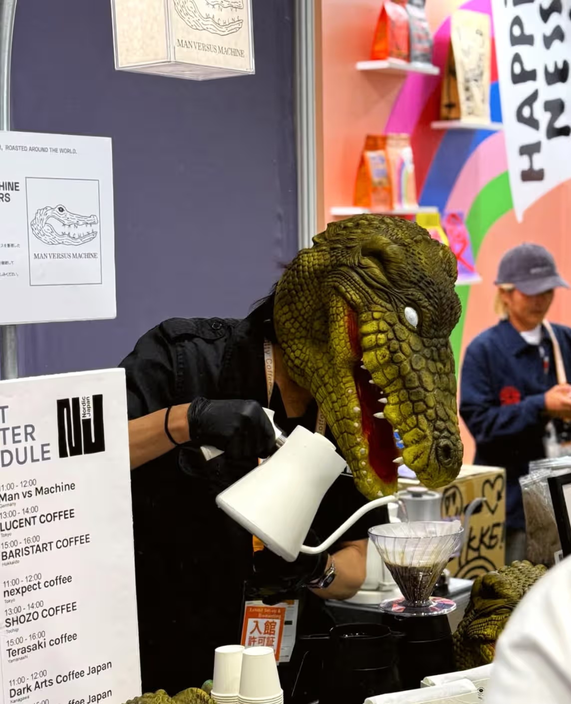
Munich has its fair share of coffee shops, but few have a crocodile watching over the espresso machine.
Founded in 2014, Man Versus Machine (MVSM) has carved out its own corner of the specialty coffee world. The independent roastery focuses on carefully sourced Arabica beans, thoughtful roasting, and a genuine appreciation for good coffee.
Each coffee receives its own roast profile, developed to highlight the natural characteristics of the beans. Using a Loring roaster, the team works towards balanced, sweet, and expressive results.
Over the years, MVSM has found its way into cafés, restaurants, and homes well beyond Munich. Its coffee is served across Europe and further afield, including in Michelin-starred establishments.
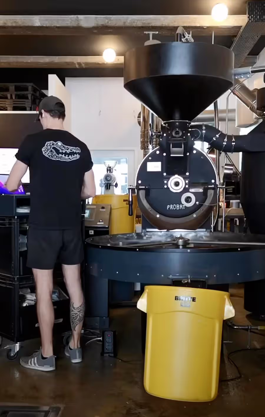
Through it all, the roastery has maintained its independent character, bringing the same attention to detail to every new coffee it releases.
Every good brand has a story. This one has teeth.
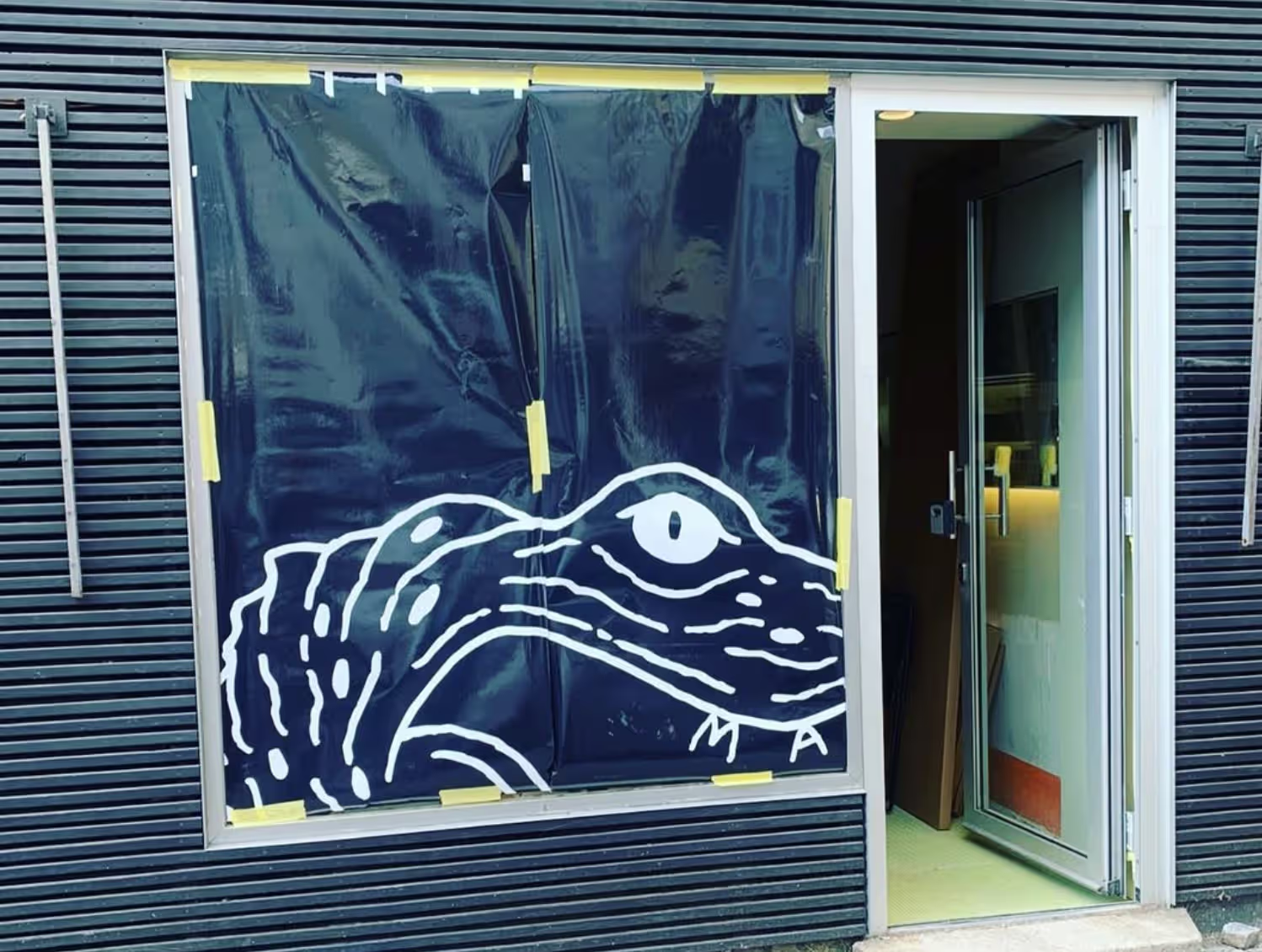
MVSM's unmistakable crocodile was created by New York-based designer Jon Contino, whose hand-drawn lettering and illustrations have helped shape the brand's distinctive personality.
With its rough edges, expressive lines, and mischievous grin, the crocodile has become a familiar face across MVSM's coffee bags, cups, clothing, and merchandise.
There's something wonderfully unexpected about seeing a crocodile on a bag of specialty coffee. The illustration brings a sense of humour and confidence to a category often filled with restrained, minimalist branding.
Over time, this visual identity has opened doors to creative collaborations with brands including Artek, Nudie Jeans, and Peak Performance.
The crocodile has travelled far from its Munich home, carrying the MVSM identity wherever it goes.
Coffee packaging is often the first physical encounter customers have with a roastery. Before anyone opens a bag or brews a cup, the design has already made an impression.
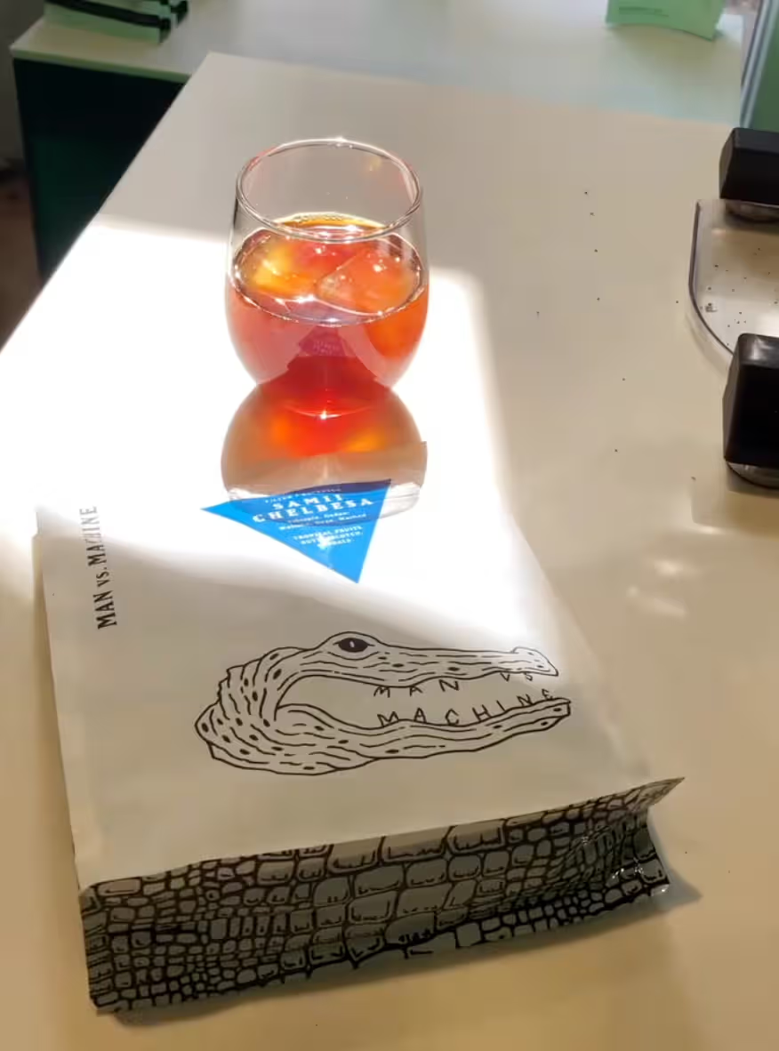
MVSM has built a packaging system that feels playful, confident, and remarkably consistent.
Its earlier coffee bags featured clean white backgrounds, bold crocodile illustrations, and colourful geometric labels. Colours and shapes helped distinguish different coffees and processing methods, making an evolving product range easier to navigate.
The visual system was simple enough to work across different formats and flexible enough to accommodate new releases.
Whether sitting on a café shelf or arriving at someone's doorstep, the packaging carried the same unmistakable personality.
It's the kind of design that makes a coffee bag worth keeping on the kitchen counter.
In September 2026, the crocodile got a new wardrobe.
MVSM introduced a redesigned packaging collection, bringing fresh textures, expressive typography, and shimmering inks into its established visual identity.
The updated bags embrace a bolder material presence, with surface details that give the packaging a distinctive look and feel. The crocodile remains central, tying the new designs to the brand's familiar visual language.
Sustainability also plays a role in the update. According to MVSM, the new packaging incorporates post-consumer recycled materials and is carbon-neutral.
Together, these details create a packaging system that feels fresh while remaining recognisably MVSM.
For an established coffee brand, that balance matters. Each redesign offers an opportunity to refine the customer experience, explore new production possibilities, and introduce the brand to another generation of coffee drinkers.
The charm of MVSM's packaging lies in how its individual elements work together.
The hand-drawn crocodile brings personality. Typography gives each bag its own rhythm. Colours and finishes create visual variety, while the overall design system keeps everything connected.
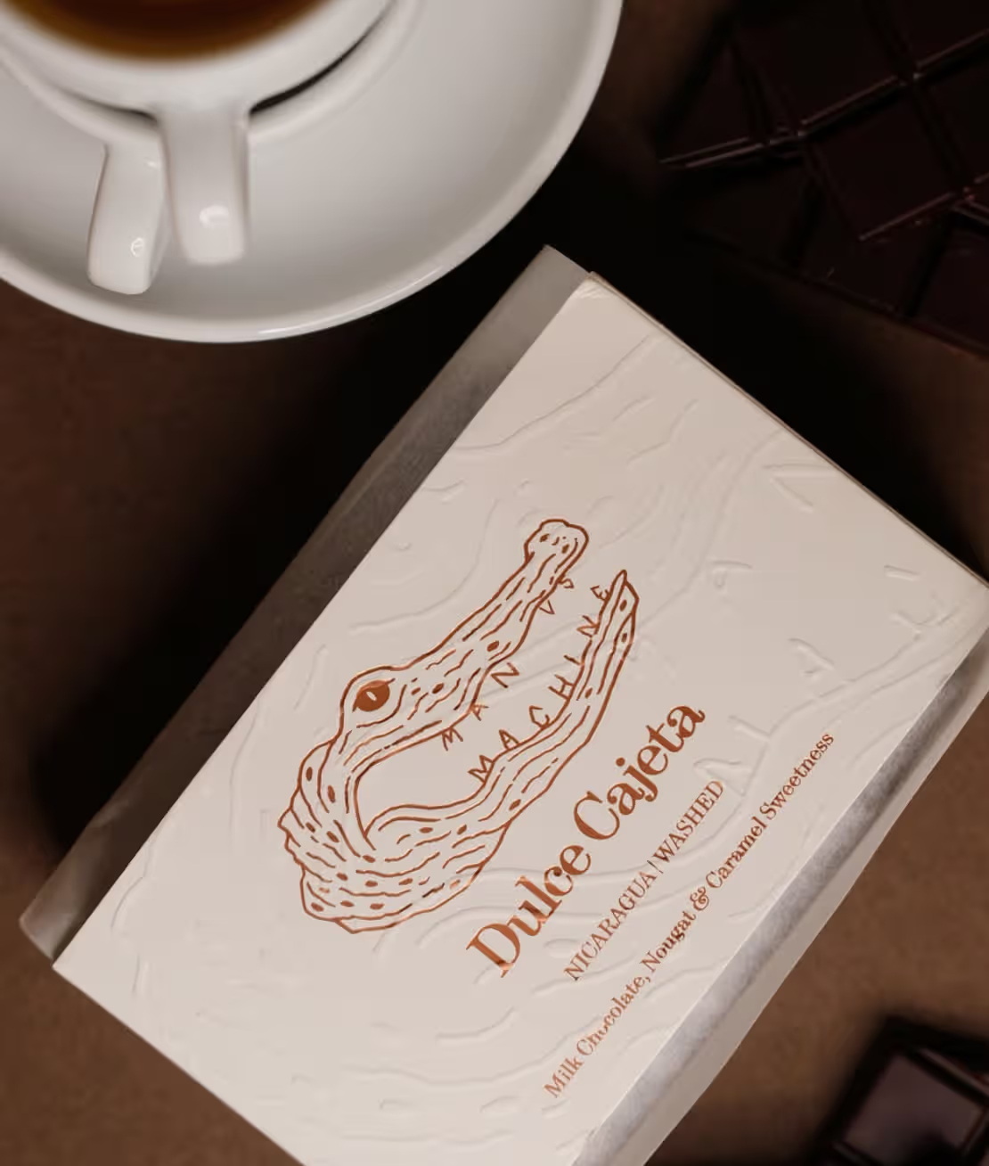
Translating these ideas into physical packaging involves careful consideration of materials, printing, and finishing techniques. The texture of a surface, the clarity of an illustration, and the consistency of colour can all influence how the finished bag feels in someone's hands.
For specialty coffee brands, these details become part of the everyday experience. A bag is picked up, opened, resealed, displayed, and handled throughout its life.
Good packaging makes each of those moments feel considered.
MVSM understands this well. Its bags reflect the same curiosity and attention to detail that go into the coffee inside.
More than a decade after opening its doors in Munich, Man Versus Machine continues to bring together great coffee, distinctive design, and a healthy dose of personality.
Its crocodile has become a familiar character in the specialty coffee world, and its evolving packaging shows how a strong visual identity can stay fresh through changing materials, formats, and creative ideas.
At Holden Pak, we share that appreciation for thoughtful packaging. From material selection to printing and finishing, we help coffee brands bring their creative ideas to life, one bag at a time.
We’ll reply within 24 hours to confirm the details and help with your quote.