
Independent insights on packaging materials, printing, sustainable packaging and design
Inside the world of Amsterdam's Stooker Specialty Coffee, where good coffee, thoughtful design and attention to detail come together.
Amsterdam has a thriving specialty coffee scene, with independent roasteries, neighbourhood cafés and a growing community of people who care about what goes into their daily cup. Among them is Stooker Specialty Coffee, a roastery that has been building its reputation since 2014.
Founded by Florian Hessel and Onno van Zanten, Stooker grew out of a shared passion for great coffee and a desire to make specialty coffee more accessible. Over the years, the company has established itself as a familiar name in Amsterdam, with its coffees now served in more than 200 restaurants and hotels across Europe.
Beyond the coffee itself, Stooker has developed a distinctive visual identity. Its signature blue and white packaging is instantly recognisable, with clean typography, carefully arranged information and a simplicity that feels both practical and considered.
It's a design that has become an important part of how people recognise and remember Stooker.
Stooker's philosophy can be summed up in two words: "All good." Behind this simple expression is a commitment to coffee quality, responsible sourcing and the people involved in producing it.
The team works with trusted importers and producers to source seasonal coffees from different growing regions, selecting beans for their individual qualities and developing roasting profiles that bring out their natural characteristics. Traceability is an important part of this process, helping Stooker understand the origins of its coffee and maintain meaningful relationships throughout its supply chain.
In 2022, Stooker became a certified B Corporation, reflecting its commitment to responsible business practices and its broader social and environmental impact.
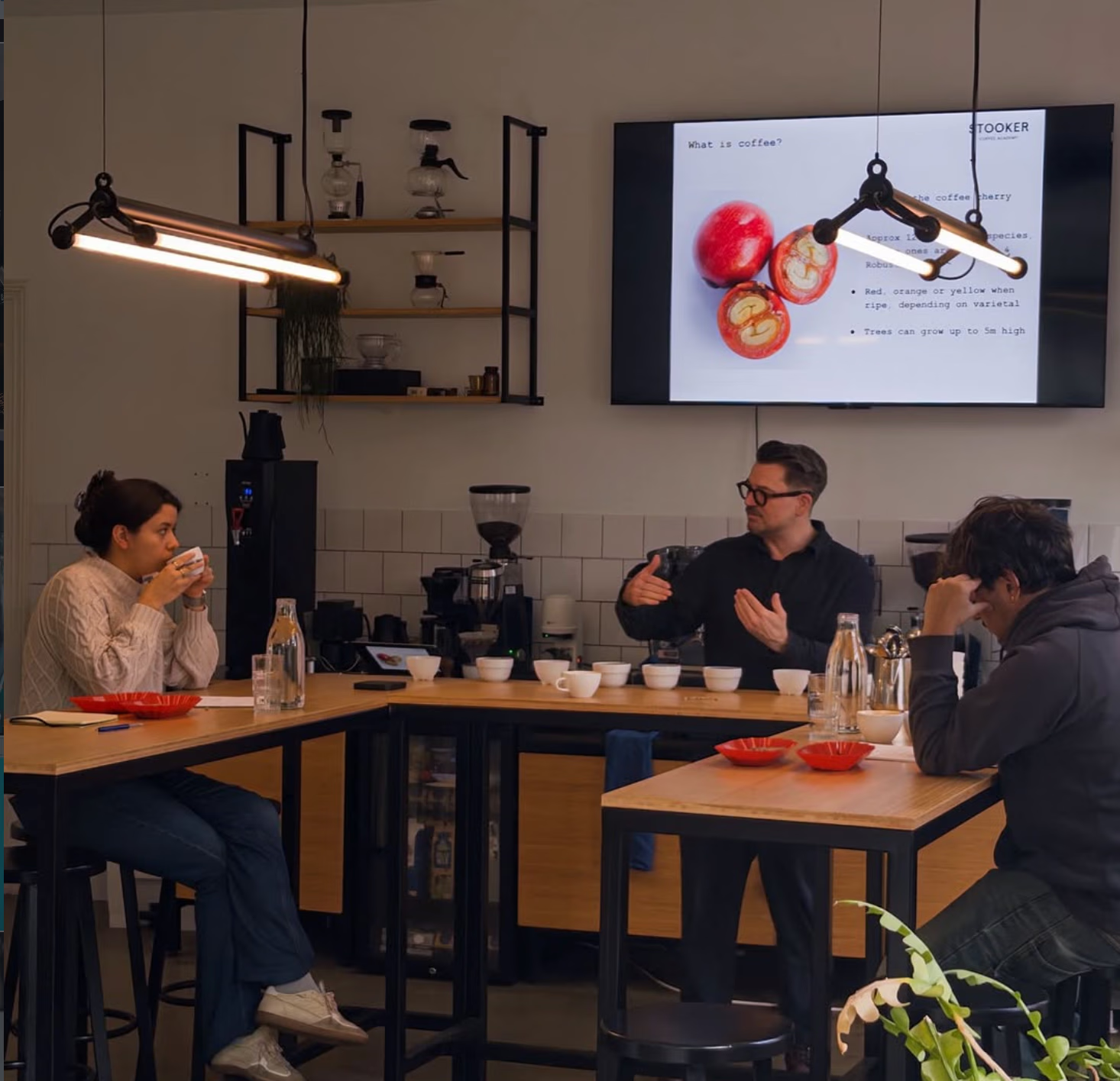
Education also plays an important role in the company's work. Through the Stooker Coffee Academy, the team shares its knowledge with professional baristas, coffee enthusiasts and newcomers through workshops and SCA-certified training courses.
Together, these efforts reflect a thoughtful approach to coffee, where quality extends beyond the finished cup to include the people, knowledge and decisions behind it.
Stooker's packaging has evolved over the years, while its distinctive blue and white identity has remained remarkably consistent.
The design makes good use of space, with straightforward typography and a clear information hierarchy that allows each coffee to have its own character while remaining part of the same collection. Details such as origin, processing method and flavour profile help customers understand what they're buying and offer a small introduction to the people and places behind each coffee.
For a brand that values transparency and education, these details are a natural extension of its philosophy.
There's also a practical quality to the design. Whether displayed on a café shelf, placed beside an espresso machine or sitting in someone's kitchen, the packaging feels familiar and easy to recognise.
Its simplicity places particular importance on the quality of production. With a limited colour palette and carefully arranged typography, small variations in printing or finishing can become more noticeable, making consistency an essential part of the manufacturing process.
Recently, we spent some time at the Holden Pak factory exploring the manufacturing process behind Stooker's coffee packaging, following the details that help turn its familiar design into a finished product.
One of the most important considerations is colour accuracy. Stooker's signature blue plays a central role in its visual identity, so maintaining a consistent appearance throughout production is essential. Precise printing also helps preserve the clarity of the typography and smaller design elements, ensuring that the finished packaging stays true to the original artwork.
Material selection, lamination and bag making each contribute to the final result. Coffee packaging needs to protect its contents during storage and transportation while maintaining the appearance and functionality expected by the customer. As the printed material moves through production, attention is given to dimensions, sealing and overall consistency.
Quality inspection forms another important part of the process, helping ensure that the finished bags meet the required specifications and maintain a reliable standard across the production run.
At Holden Pak, working with Stooker's packaging gave us an opportunity to appreciate the relationship between good design and careful manufacturing. Even a seemingly simple coffee bag involves many small decisions, and the quality of the finished product depends on how well those details are carried through.
What makes Stooker interesting is the consistency of its approach. Its commitment to coffee quality is reflected in its sourcing and roasting, its interest in education helps people better understand the product, and its packaging brings these values together in a clear and recognisable visual identity.
For Holden Pak, working with specialty coffee brands offers a fascinating look at the different ways companies express their personalities through packaging. Some embrace colourful illustrations and elaborate details, while others find their identity in carefully chosen colours, typography and materials.
Stooker has developed a visual language that feels entirely its own, and its blue and white bags have become a familiar presence in the specialty coffee community.
Our recent time at the Holden Pak factory offered a closer look at the care involved in producing that packaging, and a reminder of how much thoughtful work can sit behind something we encounter every day.
Coffee by Stooker Specialty Coffee, Amsterdam.
Packaging manufactured by Holden Pak.
We’ll reply within 24 hours to confirm the details and help with your quote.