
Independent insights on packaging materials, printing, sustainable packaging and design
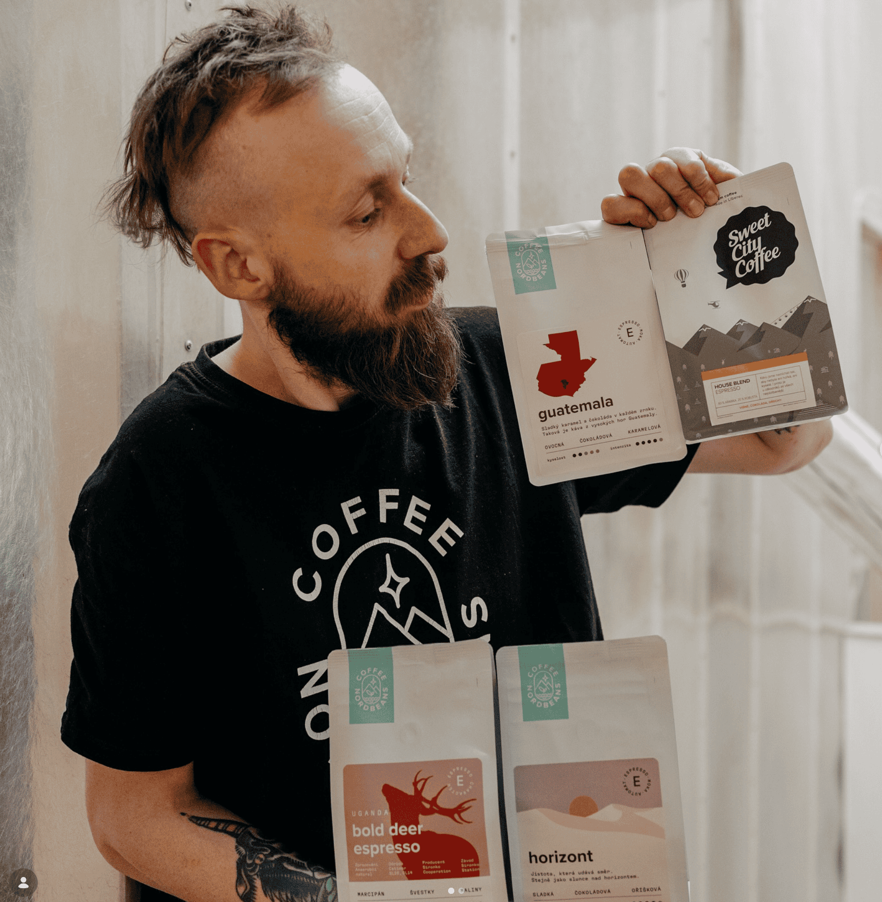
Before Nordbeans was founded, there was Sweet City.
The story began in Liberec in 2014, when brothers Martin and Karel Kozel ran Sweet City as a small business selling coffee accessories, coffee from other brands and cakes. By early 2015, they had started roasting Sweet City coffee on a small-scale setup. Soon afterwards, they worked with Jaromír to develop the idea for Nordbeans, which officially launched its first coffee later that year.
Sweet City remained part of the story. Today, Nordbeans presents it as a distinct coffee brand with a clear purpose, a familiar flavour profile and a packaging identity that is instantly recognisable.
For Holden Pak, producing custom coffee packaging for Sweet City meant working with a visual language that already had a strong sense of place. The goal was not to redesign the brand, but to translate its identity consistently onto the finished bag.
Sweet City is positioned for coffee drinkers who prefer a more traditional cup. Nordbeans describes it as a gateway to specialty coffee for people who enjoy darker roasts, low acidity, full body and pronounced sweetness, often with chocolate and nut-led flavours.
The range is particularly well suited to espresso and automatic coffee machines, while several coffees are also recommended for moka pots and French presses. The proposition is straightforward: better coffee, without asking customers to leave behind the flavours they already enjoy.
That same clarity comes through in the packaging. Sweet City does not need to look highly technical or experimental. Its identity is built around something much more immediate: the mountains.
Nordbeans describes Sweet City as easy to recognize by its mountain-themed bags. The reference is not arbitrary. Liberec is located close to the Jizera Mountains, and the landscape has been part of the wider Nordbeans identity from the beginning. When the Nordbeans brand was created in 2015, its first logo was designed to symbolize the Jizera Mountains and the surrounding forests.
Sweet City carries that connection forward in its own way. The mountain artwork creates a strong visual thread across the range and ties each product back to the place where the story began.
For a coffee brand, such consistency matters. Coffees change, new products are introduced and information on the pack may evolve, but customers still need something familiar to recognize. A clear packaging system can bring a growing range together without making every product seems identical.
For Sweet City, Holden Pak produced custom-printed coffee bags based on the brand's existing artwork. Moving a design from screen to physical packaging may sound simple, but the finished bag still needs to preserve the details that make the identity work. Illustration, typography, colour, layout and product information all have to work together comfortably.
Coffee packaging also serves more than one purpose. It protects the product, but it is also one of the most visible expressions of the brand. A customer may first encounter the bag in a café, on a retail shelf or in an online store. In each setting, recognisability matters.

Sweet City’s mountain-led design gives the range a repeatable structure without taking away its character. It demonstrates how custom coffee packaging can support a brand without becoming the story itself.
Consistency is also central to the way Nordbeans describes Sweet City coffee. The roastery selects coffees from fresh harvests with the aim of keeping them available throughout the season, and states that the Sweet City range receives the same quality-control attention as its other coffees.
Packaging works on a similar principle. When customers return to a coffee they know, the visual experience should still feel familiar. Over time, recurring details—the mountains, the layout and the overall appearance of the bag—become part of how the brand is remembered.
Sweet City has come a long way since its early days in Liberec, but its packaging still keeps the story close to home. The mountains connect the range to its roots, while a consistent system gives the brand room to continue growing.
Sometimes good packaging does not need to say more. It simply needs to make the brand easier to recognise and remember.
For Sweet City, every bag carries a little piece of Liberec with it.
We’ll reply within 24 hours to confirm the details and help with your quote.