
Independent insights on packaging materials, printing, sustainable packaging and design

Kahwe feels closely tied to the place where it roasts.
Its roastery sits in Hatanpää, Tampere, inside a historic red-brick building that still carries the industrial character of the city. Kahwe itself draws attention to that setting: the space connects the brand to an older working Tampere, where coffee was part of the rhythm of the day. Today, every batch is still roasted there, with the company placing equal weight on freshness, quality and an unforced approach to specialty coffee.
That connection to place eventually moved beyond the roastery. When Kahwe refreshed its visual identity and packaging, the red brick became part of the system itself — not as a literal illustration, but as a colour, a reference point and a way of keeping the brand grounded in where it comes from.
Kahwe was founded in 2017 by Joel Marttala, a former chef and barista who had already been working with coffee for several years. The roastery grew from a desire to understand coffee more deeply: where it comes from, how it behaves in roasting and how much of its character can be brought into the cup.
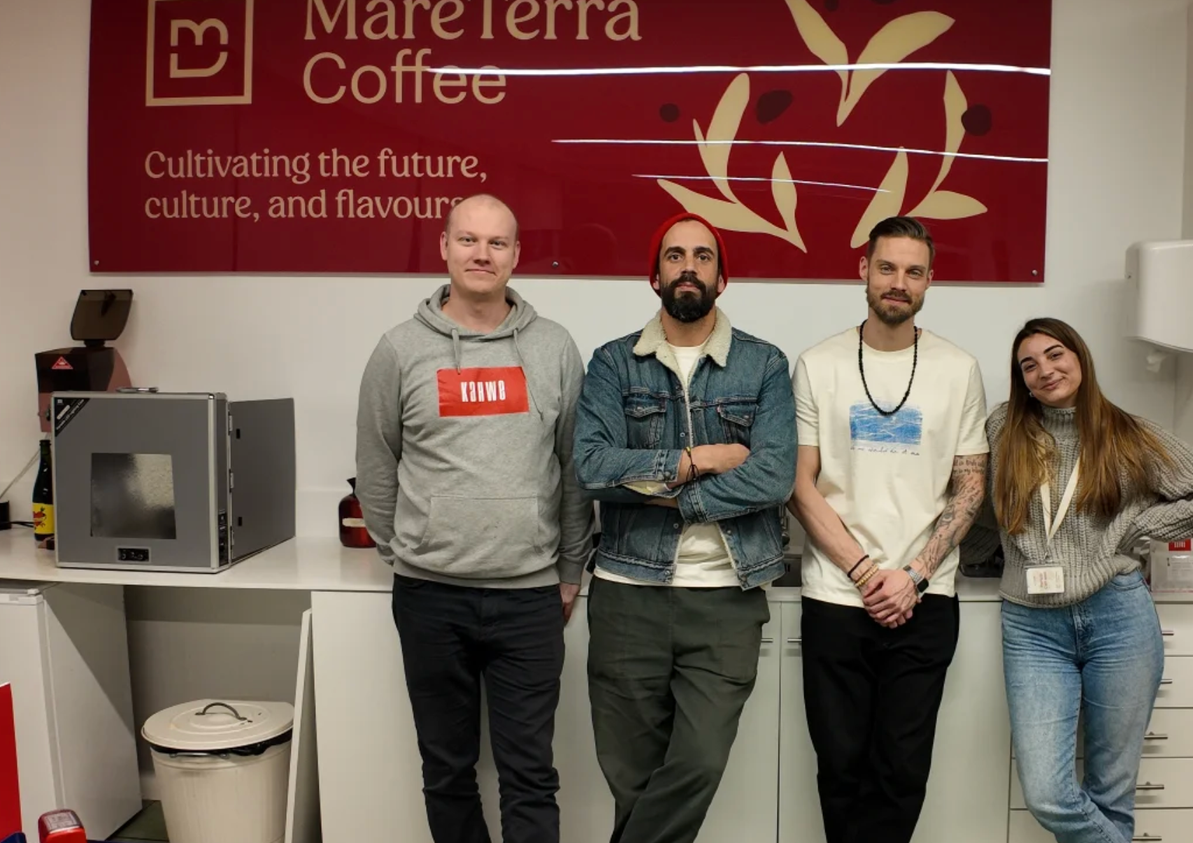
That seriousness does not translate into a formal or exclusive tone. Kahwe describes itself as relaxed, honest, open and down to earth. The brand talks openly about sourcing, producer relationships and fair compensation, while still making room for humour and visual play. The result is a specialty coffee company that feels considered without feeling distant.
This balance became important when the visual identity was revisited. The packaging needed to carry enough character to be recognisable, while remaining flexible enough for a roastery whose coffees change with seasons, harvests and availability.
For that next stage, Kahwe worked with Turipamwe, the creative studio behind the refreshed brand identity and packaging system. Rather than treating each coffee as a separate packaging project, the studio developed a structure that could keep evolving as the range changed.

The core idea is simple: one customised base bag, combined with interchangeable labels. The base packaging carries the brand. The labels handle the variables — origin, process, tasting notes, seasonal information and the personality of each coffee.
For a specialty roaster, that distinction is practical. Green coffee is inherently seasonal, and the product mix can change far more quickly than a fully custom-printed packaging programme. By separating the permanent parts of the identity from the changing parts of the coffee information, Kahwe created a system that can stay consistent without becoming rigid.
The red-brick tone provides the visual anchor. An extended palette, inspired by coffee flavours and aromas, gives the labels room to move. A secondary mark combining a K with a heart adds another recognisable element without competing with the main identity.
The system also makes room for something less functional: illustration.

Namibian artist Petrus Amuthenu, also known as Jero, created a series of drawings for Kahwe after taking part in a shared coffee tasting. Rather than illustrating origins in a literal way, the work responds to the sensations, associations and small moments that come with drinking coffee.


That choice gives the identity a different kind of texture. The base bag remains restrained and recognisable, while the labels and illustrations can introduce movement, surprise and variation. It mirrors Kahwe's own tone: professional where it matters, but never overly polished or self-serious.
Once a packaging system is established, its success depends on how consistently it can be reproduced.
HoldenPak manufactures Kahwe's customised coffee bags, turning the fixed parts of the identity into the physical base used across the range. Turipamwe's published project documentation credits HoldenPak as the packaging manufacturer, linking the design work directly to the production process.
That production role is especially important in a system like this because the labels are designed to change while the bag itself remains stable. The red-brick colour, logo placement, proportions and overall finish have to create a dependable visual foundation. If the base shifts too much between runs, the flexibility of the label system becomes less effective.
The task is therefore not to make the packaging louder. It is to make the underlying system reliable enough that every new coffee still feels like Kahwe.
Kahwe's packaging works because it accepts a basic truth about coffee: the product is always moving.

Origins rotate, harvests change and new lots appear throughout the year. Instead of fighting that movement, the packaging gives it a clear structure. The fixed bag keeps the brand recognisable; the labels allow the details to stay current; the illustrations give individual releases their own character.
At the centre of it all is a colour borrowed from the place where Kahwe roasts. The red is not simply a graphic choice. It echoes the brick building in Hatanpää and gives the packaging a subtle connection back to Tampere.
That makes the system feel less like branding applied from the outside and more like an extension of the roastery itself.
For HoldenPak, producing Kahwe's bags means preserving that balance from one run to the next: enough consistency to build recognition, and enough openness for the coffee to keep changing.
A little Tampere in every bag.
We’ll reply within 24 hours to confirm the details and help with your quote.