
Independent insights on packaging materials, printing, sustainable packaging and design

There is very little about BAD Coffee that tries to blend in.
From its bright yellow roastery in Hackney Wick to the oversized black BAD printed across its coffee bags, the East London micro-roaster has built a brand that is direct, playful and deliberately hard to miss. BAD describes itself as a female-led specialty coffee roastery making great-tasting, unpretentious coffee for everyone. Behind that attitude is a serious approach to coffee, shaped by small-batch roasting, thoughtful sourcing and a hands-on way of working.

HoldenPak is BAD Coffee’s packaging supplier. During production, we followed its yellow bags through our factory, from printing to bag making, to see how such a simple visual identity is translated into a finished pack.
The name BAD Coffee grew out of a reaction to a specialty coffee world crowded with brands talking about “good coffee”. Co-founder Mandi had already spent years working with coffee in Hackney Wick before BAD began roasting in 2022. Learning to roast involved experimentation, mistakes and trusting her own senses—a process that became part of the brand’s character.
BAD does not pretend that specialty coffee has to be polished or intimidating. Its language is self-deprecating, open and deliberately approachable, while the coffee itself is taken seriously. The roastery sources coffee from smallholder farms, cooperatives and producers around the world, then roasts it in small batches at its Hackney Wick space.
That balance is central to BAD: informal on the surface, considered underneath.
The packaging follows the same logic.

BAD describes its visual direction as an “anti-aesthetic”, shaped in part by Hackney Wick’s warehouse, studio and DIY culture. The roastery features yellow doors, floors and counters, while the coffee bags carry the same intense yellow background with oversized black lettering.
It is a remarkably simple system—which is precisely why the production details matter.
The yellow bag creates instant recognition, while individual coffees are differentiated by labels featuring their names, origins, processes and tasting notes. BAD’s range changes throughout the year, so this flexible structure allows new coffees to come and go without requiring the brand to be rebuilt each time.
Every bag is also labelled by hand at the roastery. The base packaging remains unmistakably BAD, while the final label gives each coffee its own identity.
When a design is this simple, there is nowhere for inconsistent production to hide.
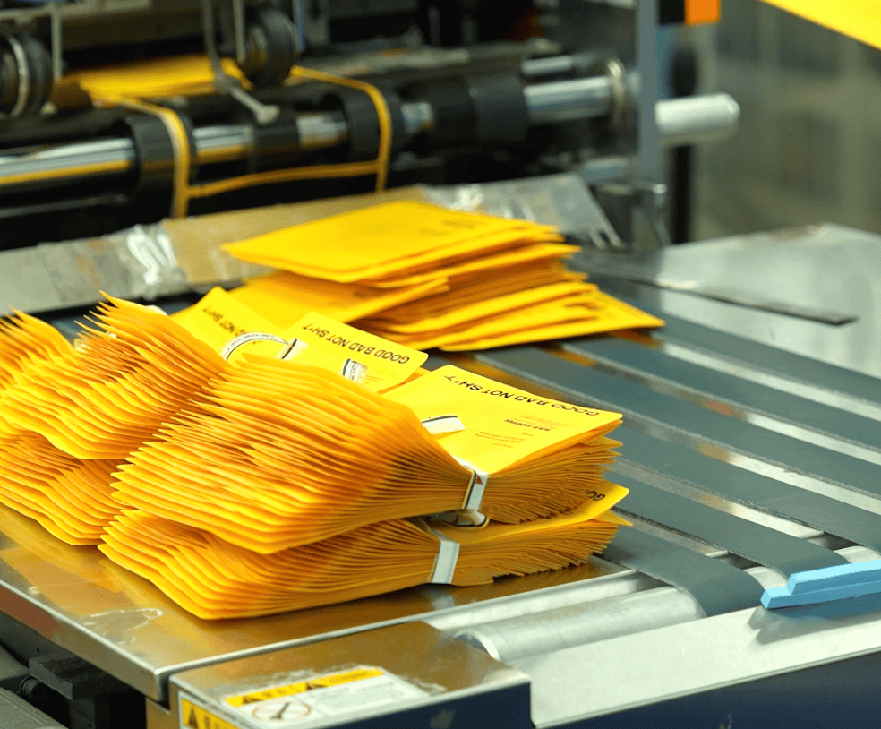
At HoldenPak, BAD Coffee’s packaging passes through a series of production stages before reaching the roastery. During one production run, we followed the bags through the factory to document the process in detail—from printed material to the final converted coffee bag.
Large areas of solid colour need to remain stable. Oversized typography needs clean edges and consistent positioning. Once the material is formed into a bag, the proportions of the design must still feel right from front to back.
These are details that customers rarely notice consciously. They simply expect the bag in their hands to look like the brand they recognise online or at the roastery. For BAD, that recognition happens almost immediately: yellow first, then four black letters.
That simplicity places even greater emphasis on consistency. With fewer decorative elements to draw the eye, colour shifts, registration issues or changes in the overall appearance of the pack become much more noticeable.
The physical character of the packaging fits naturally with the way BAD works.
The team says that much of its Hackney Wick roastery was built by hand and continues to evolve around the needs of a working coffee business. Design is handled in-house. Coffee is roasted on site in small batches. Bags are labelled one by one.
The packaging therefore does not feel like a separate branding exercise. It belongs to the same system: practical, tactile and intentionally rough around the edges.
For HoldenPak, producing BAD Coffee’s bags is less about adding complexity and more about protecting what already makes the design effective. The colour needs to remain bold, the type needs to stay clear and the finished bag needs to preserve the immediacy of the original idea.
BAD Coffee has built a brand that needs very little explanation. Its yellow bags make the point quickly.
A little loud, deliberately imperfect and very hard to mistake for anything else.
We’ll reply within 24 hours to confirm the details and help with your quote.